Handleiding

Leer hoe je websites bouwt met onze AXIO-CMS handleiding.

Blocks

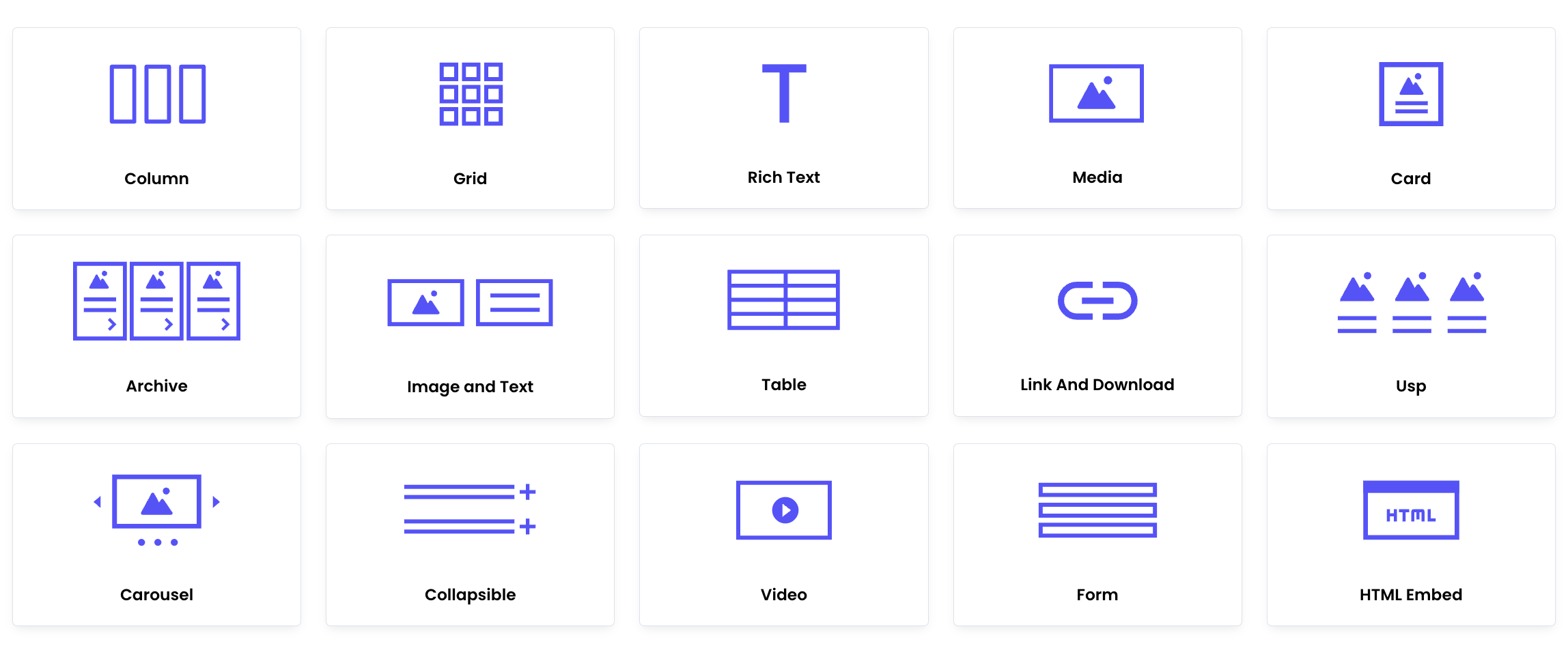
Blocks allow you to customize your website to suit your needs. You can choose from a variety of layout and content blocks, such as columns, grids, rows, media, tables, and more. In this section, we will explain each layout and content block in detail and guide you through adding and editing them effectively.

Layout blocks

Layout blocks allow you to structure your page by defining its overall arrangement. These blocks include columns and grids, which help organize content in a flexible and visually appealing way. Once you have added layout blocks, you can fill them with content blocks, such as images, text, buttons, or media, to create a well-structured and engaging page.

Managing Blocks

You can expand or collapse all blocks using the arrow at the top right of each block. Under the three-dot menu, you will find options to move, duplicate, or delete blocks.

Column

If you want to arrange your content in columns, use a Column Block. This layout block allows you to divide your page into multiple vertical sections.

  • Assign a size to each column — choose from one-third, half, or two-thirds of the available content width.
  • Add Block to insert layout or content blocks into each column.
  • Add Column to create additional columns within the block.
  • To enhance visual clarity, you can also set a background color for the entire column block.

We recommend using the live preview to see how your layout will appear on the page. For better organization, you can rename your column block by clicking on the title of the column and entering a custom name.

Grid

The Grid is a layout block that allows you to structure content in a flexible grid format. While it may resemble a column layout, the key difference is that a grid can be both horizontal and vertical, offering more control over how content is positioned.

You can add multiple layout blocks (such as images, text, or buttons) into the grid cells.

Content blocks

Content Blocks are the building blocks used to add actual content to your pages—such as text, images, videos, buttons, and more. Unlike layout blocks, which define the structure of the page (e.g. grids or columns), content blocks fill that structure with meaningful information for your visitors.

Rich Text Block

To add text content to a page, use a Rich Text Block. You can choose from several size options: one third, half, two third, and full. The selected size determines how wide the text will appear on the web page.

You can enter and format your text directly in the rich text editor. The editor supports various formatting options, including: multiple heading levels (e.g. Heading 2, Heading 3), bullet, numbered lists, list with checkmarks (custom unordered list), code blocks, text colors and more.

If you're using headings, make sure to structure them logically (e.g., do not skip heading levels). Proper use of headings improves both usability and accessibility.

For more information, refer to the WCAG guidelines on headings. Following these guidelines helps make your website accessible to all users, including those using screen readers.

More information about headings

Media block

With Media block, you can add images and small videos to your pages, enhancing the visual appeal of your content.

Alt Text

Ensure that each media file has the appropriate alt text. Alt text is a description of the image's content and is used by screen readers and Google bots for indexing. A good alt text improves accessibility and SEO for your website. Want to learn more about writing effective alt text? Check out our blog on alt texts.

Blog about effective Alt text

Archive Block

An archive block allows you to display cards of your posts or team members on a page. These cards link to the posts or team members you've selected.

Below you can see examples of archive blocks: one for Posts and one for Teams.

Creating an archive block
  • To create an archive block, start by adding Intro Content to provide a description, such as a title, for the block.
  • Next, under Populate by , you can choose a pre-made collection to automatically pull content or manually select individual cards to display. This allows for flexibility in showcasing specific posts or team members in your archive block.
Collection
  • Select a Collection to Show, such as Posts and Team Members. This determines which group of content will be displayed in the archive view.
  • With the Post Types to Show setting, you can specify which type of content you want to display. This option allows you to show all posts that belong to a specific post type, such as projects, blogs, or custom post types defined in your project.
  • For a more targeted selection, choose the Categories to Show that are assigned to the posts.
  • Set a Limit to control how many cards are shown within the archive block.
Read the posts section
Individual

Under the Selection setting, you can choose a specific post to display in the archive block. This allows you to manually select individual posts—even from different post types—rather than displaying an automatically generated list.

Image and text block

Use an image and text block to place an image alongside text on a page. This block allows you to create a visually engaging layout by combining media and written content.

Type

There are several types to choose from, depending on how you want the image and text to be displayed.

Text and Image Block: A simple layout where the text and image are placed side-by-side.

Image, Text, and Background Block: Allows you to set a background color or image behind the text and image, creating a more layered and dynamic design.

Block Content with Gap: This option places a gap between the text and image, adding more whitespace for a cleaner look.

Block Content with Gap: This option places a gap between the text and image, adding more whitespace for a cleaner look.

Table

You can add a table by entering CSV data. The system will convert the CSV input into a structured table format. This allows you to easily import and display data without manual formatting.

Link and Download

Use the Link and Download block to add a link or download. You can choose between:

Internal link: Link to a page on your website.

Custom URL: Link to an external website.

Download: Upload a file to create a downloadable link.

USPs

Use the USP block to highlight your unique selling points (USPs).

  • To use the USP block, you must enter at least two USPs.
  • Create a USP by adding a title and text.
  • Optionally, select an icon from the available options—this is not required.
  • Click Add USP item to add a new USP.

Carousel

Create a carousel by adding carousel slides.

  • Each slide can contain an image and text.
  • To display the carousel in full width, set Position to Fullscreen.

Collapsible

Use the Collapsible block to organize content in expandable sections.

  • Enter a title for the collapsible section—this is what users will click to expand or collapse the content.
  • Add block to fill the collapsible with content.
  • Add item to add another collapsible item.

Collapsibles are useful for FAQs, detailed explanations, or structuring long content in a compact way.

Video

Add a video to your content by entering the URL of the video.

  • Choose the size and position to control how the video is displayed.
  • Align the video to the left or right using Alignment.

This allows you to seamlessly embed and style videos within your content.

Form

Select a form that you have created using the Form Builder. The selected form will be embedded into your content. The from block allows you to easily integrate and customize forms within your content.

If you want to learn how to create a form, go to the Form Builder section.

Form Builder section