Settings
The settings let you customize your website's overall design, including the theme colors, fonts, header, and footer.
Settings: General
In the Settings > General section, you can manage the general configuration of the tenant. This includes the following options:
Name: This name is used within the AXIO system to identify you site.
Favicon: Upload a favicon to give the tenant a unique identity in browser tabs and bookmarks.
Domain Name: This is the domain name that your website can be found at. You cannot change this yourself as changes here require changes in other systems as well. But with our help this can be changed of course.
Settings: Theme
Personalize the appearance of your site with the Theme Settings! This section allows you to adjust various visual elements to match your brand or personal style.
Colors
To customize the colors of your website, go to Settings in the main menu and click on Theme for the visual configuration. Here, you can change the website's colors to match your preferences. Use the color picker or enter the HEX codes of your desired colors. This allows you to easily adjust the look and feel of your site to align with your branding.
Hero
Decide what kind of hero you want to display on your website’s pages en posts. You can choose a full-width hero, title and text block with a white background and soft edges.
This is the structure of the hero component — the actual content (image and text) is added directly on the page or post.
Settings: Header
The header is the top part of every page or post in your website. It contains your logo, navigation and search.
To customize the header, go to Settings in the main menu click on Header. Here, you can add Nav Items that will appear in the header, creating the navigation menu at the top of your website. If you want to link to an internal page in the navigation, that page must first be created of course. If you want, you can slo link to external pages, outside of your own website. To grab extra attention, you could change the appearance of a link to a button.
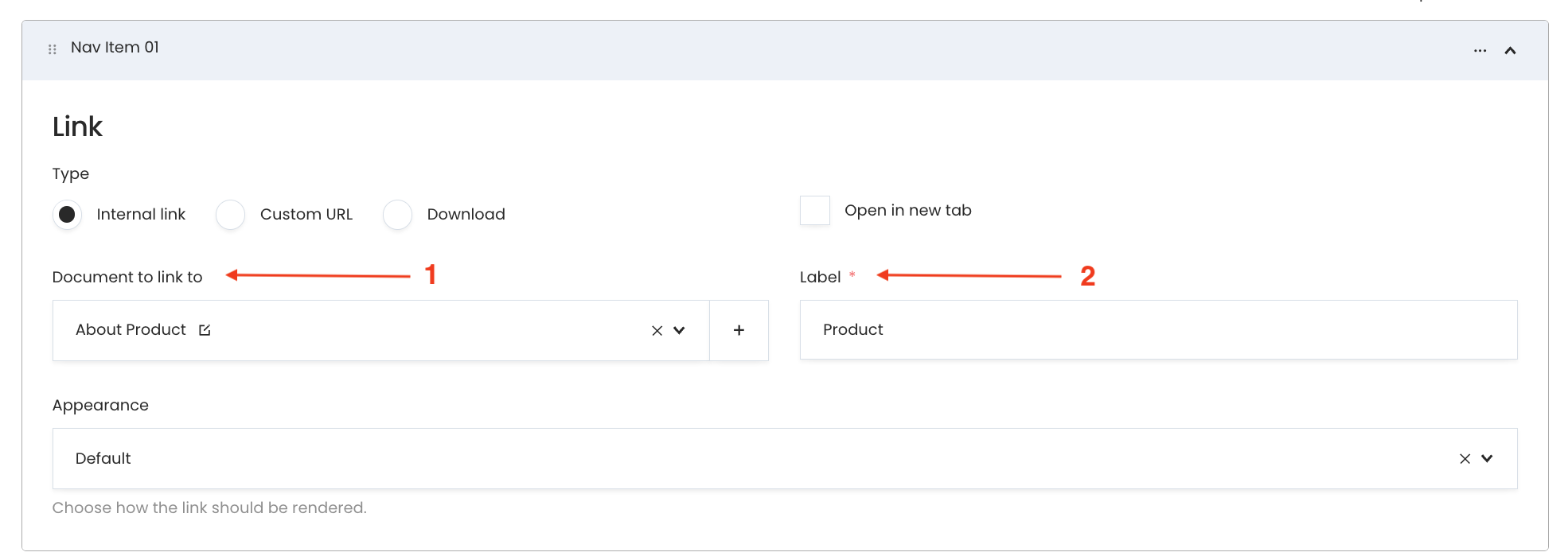
Settings: Header - Internal Link
- Choose a Document to Link To (1): Assign an internal link by selecting a document or page from your website.
- Label (2): This is the name of the link that will appear in the navigation menu in the header. Make sure to fill in the label for all languages if your website supports multiple languages.
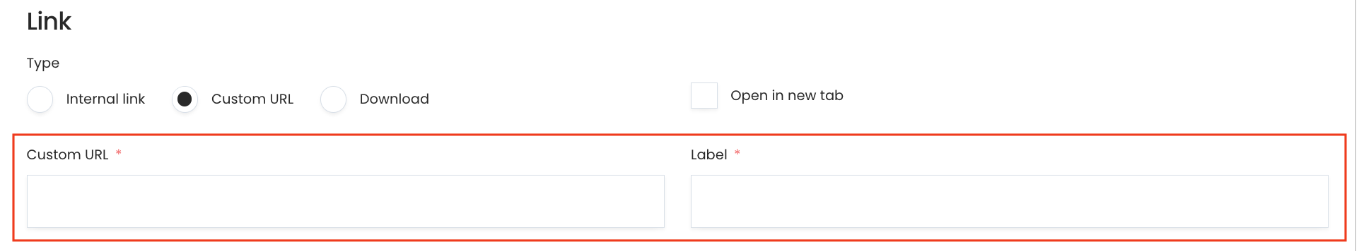
Settings: Header - Custom link
Custom Link – Use this option for an external link. Enter the URL and label for the link.
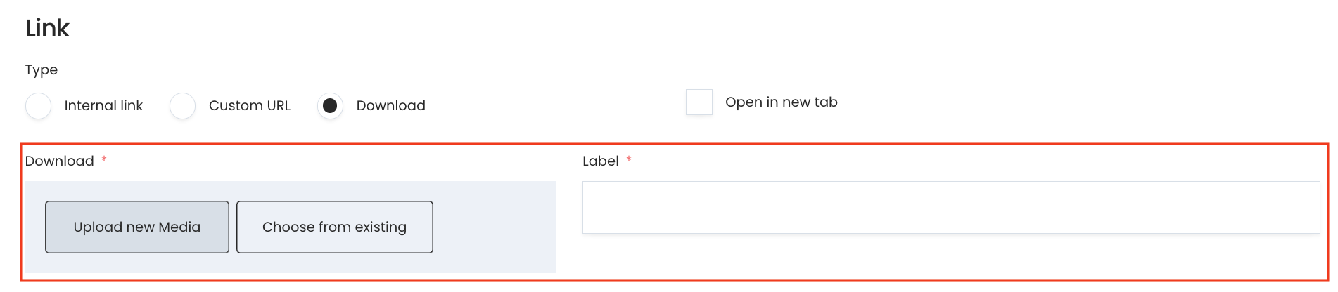
Settings: Header - Download
Download Option – Allow users to download a file. Upload a file and enter a label for the link.
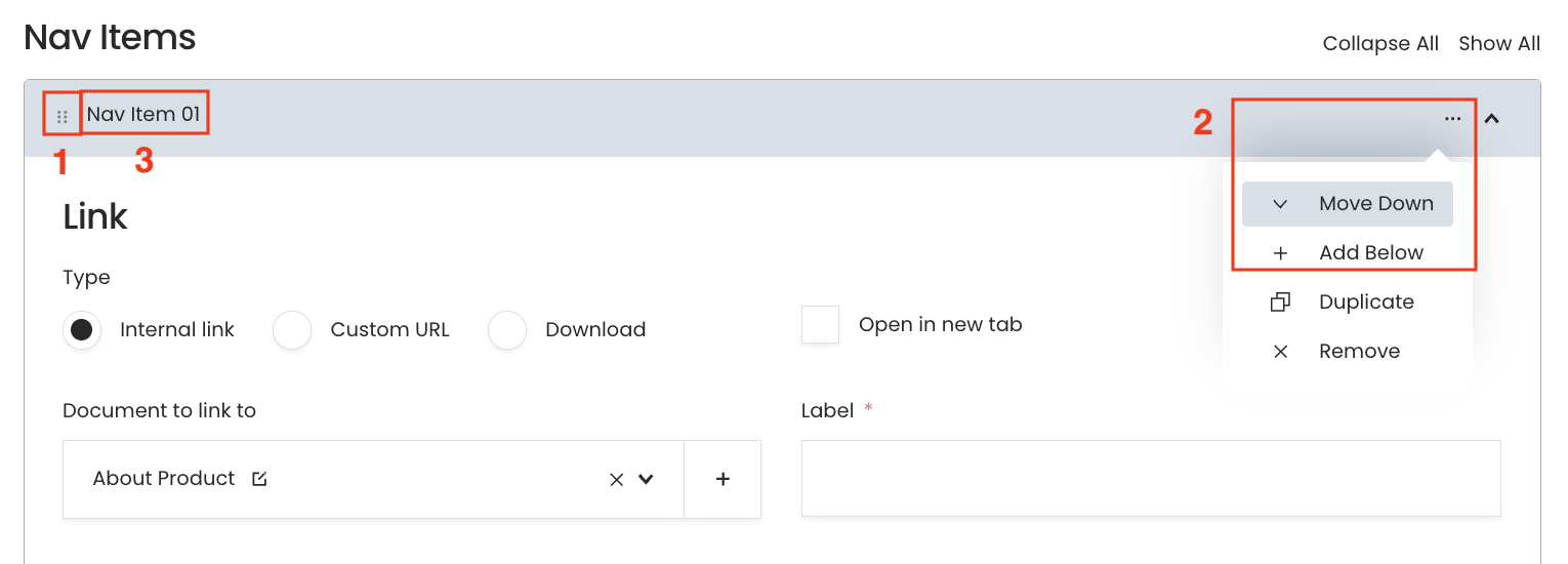
Want to change the order and name of the menu items?
Simply drag and drop them by holding the icon with six dots (1) located at the top left of each nav item. Click on the three-dot icon (2) at the top right of a nav item for additional options, such as moving it up, moving it down, or deleting it.
You can change the name of a Nav Item (3) by clicking on the current name, for example "Nav Item 01," and typing the desired name.
Adding search, background color, text color, font weight and logo
- Make sure to check the Enable search checkbox if you want to include a search option on your website.
- Select a background color if you want the header to have a colored background.
- Choose a text color to set the color of the text in the header.
- Choose a font weight to define how bold the header text should appear.
- Upload an image of your logo to display it in the header.
Settings: Footer
To customize the footer, go to Settings and click on Footer. In the footer section, you can create columns to add links, choose a background color, text color and you can insert a logo to design the footer according to your preferences.
Settings: Footer - Columns & nav items
In the Footer Settings, you can create and manage columns for the footer. Each column can be customized with the following options:
You can choose to enable Text title or enable the Link Title option to make the column title clickable, linking it to a specific URL of your choice.
Column title: assign a title to the column to indicate its purpose or content. Use the Add Nav Item option to add individual navigation items to the column. Just like the header each navigation item can have its own label and link, helping you organize footer links effectively.
Want to see an instructional video about how to add a footer? Check out this link.
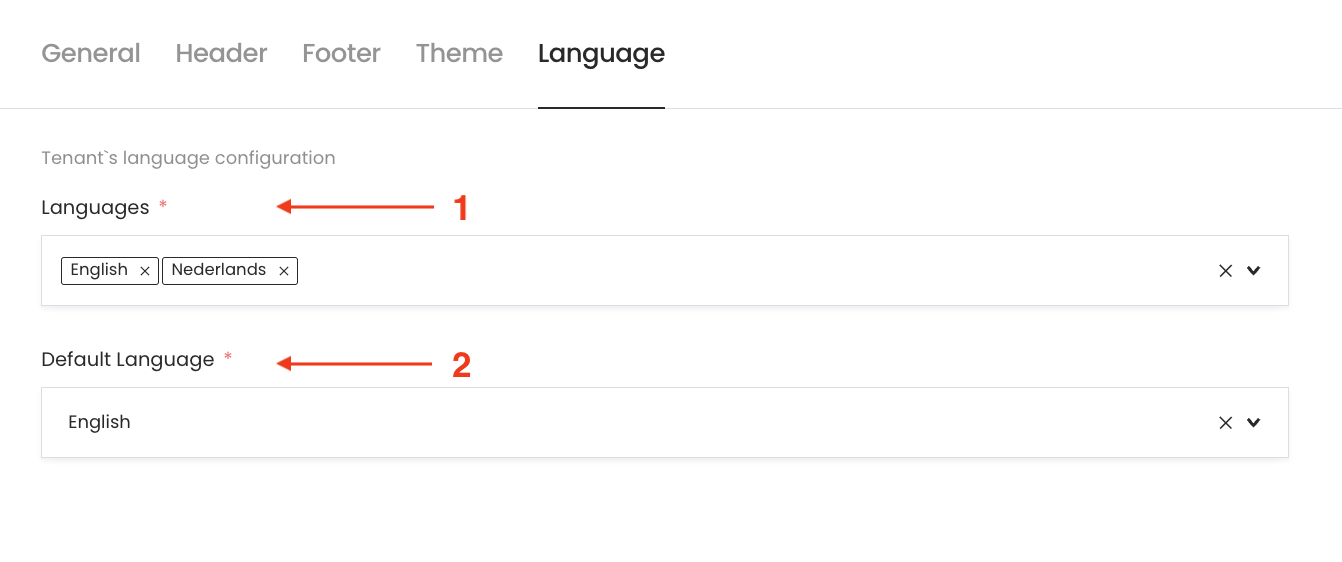
Settings: Language selector
Use the language selector in settings to add your preferred languages (2) Set a primary language as the default (1) to ensure the interface starts in your chosen language each time.
Want to see an instructional video about how to add languages? Check out this link.